Most of us have used our phones to check our bank accounts or to transfer money to a friend. When the app is well-designed, we hardly notice. However, when we run into a difficult scenario – you can’t find how to transfer funds or you’re not sure if the payment went through – it can be infuriating.
What are human factors?
The term human factors has its roots in ergonomics and historically has focused on designing jobs and equipment that are fit for people. Another similar concept called human-centered design is an approach to problem-solving that aims to make the system usable for the people for whom it was designed. Using these concepts, we can find out why we get frustrated when a system doesn’t behave how we expect.
In this review, we will inspect the interface designs of three mobile banking apps and critique them using evidence-based, human-centered design principles. By the end, we’ll identify how certain aspects of the designs might help or harm users.
Evaluating interface designs
Cognitive psychologist and design pioneer, Don Norman, claims that two of the most important characteristics of good design are discoverability and understanding.[6] For those designing interfaces, these characteristics are an important reminder that they are created for and used by humans. It may seem obvious, but specifically centering the focus on the humans for whom the product was intended ensures that the designs match their needs and capabilities. When business goals are prioritized over human goals, there can be a mismatch between user needs and options available.
How might we evaluate a user interface design? Another prominent design legend named Jakob Nielson, who co-founded a consulting firm with Don Norman, developed a set of general principles called heuristics to help us evaluate interface designs. We’ll complete a usability inspection using Nielson’s 10 Usability Heuristics for User Interface Design to help us identify patterns in the designs.
Mobile banking in a nutshell
It’s easy to take it for granted that today you can check your bank account balances and transfer funds on your phone from anywhere. Mobile banking is a service provided by a bank that allows people to process financial transactions using a smartphone or mobile device. In 2012, about a third of Americans were using mobile banking. Today, about two-thirds of Americans and 80% of millennials have reported using mobile banking.[1][2][4]
What’s the difference between traditional banking and online banking?
Traditional banking often provides mobile banking but also has physical locations and a banker that you can go speak with. Fees tend to be higher, interest rates on your money lower and overall more financial services available.
Online banking generally refers to an online-first approach to banking where accounts can be opened and managed within the app. They generally don’t have physical locations and can have lower fees and better interest rates.[4]
Both traditional and online banking usually provide mobile banking as a service. For this review, I have inspected the mobile apps for three banks, all traditional banks, two large and one smaller community bank – Chase, Wells Fargo and Merchants – respectively.
Human factors and usability heuristics
Recall requires more mental effort than recognition
The human brain has evolved to be incredibly quick at recognizing things. It’s the reason why multiple-choice questions are often easier than open-ended questions. However, recalling information without visual support is very difficult for our brains.[3][5] Perhaps this is why user interfaces exist in the first place – if humans were better at recall, maybe our phones would simply have a command line ready for instructions.
Considerations when assessing memory recognition and recall in user interfaces:
Make actions as obvious as possible
Give users easy options to choose from, instead of making them think of it themselves
Promote recognition by making information easily accessible
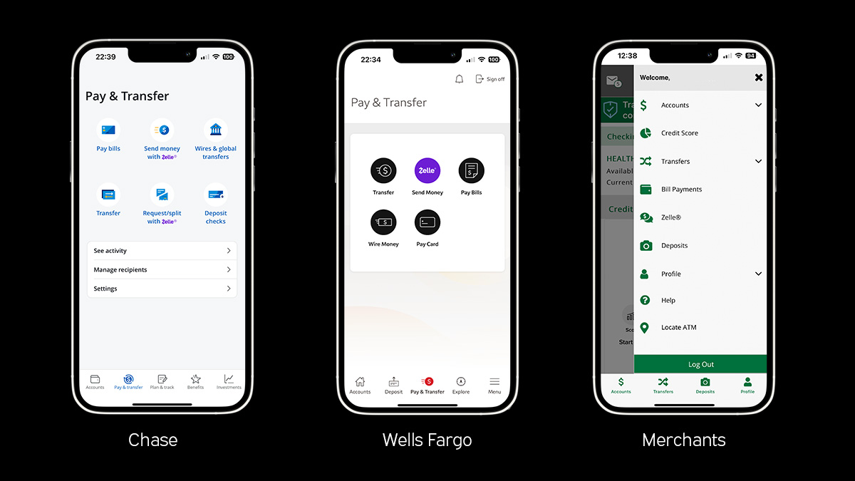
Icon usage in the mobile banking apps
Inspecting the banking apps
Clear actions with unique icons – Chase’s transfer page has buttons that are unique and recognizable with clear and concise labels that use familiar and action-oriented language. The icons are meaningful and distinct from one another. Similarly, Merchant's menu has good, clear icons that are distinct and intuitively understandable.
Icons that are similar – Wells Fargo’s transfer page has five actions with icons, two of which show flying money, what does that mean? For first-time users, these similar icons may confuse them and lead them to make mistakes.
What’s the harm?
The transfer pages on the Chase and Wells Fargo apps and Merchant’s menu follow Hick’s Law, which states that the time it takes to make a decision increases with the number and complexity of choices, by breaking the actions into easier choices. However, with ambiguous iconography, recalling which action is correct for a particular scenario may be difficult. For an action such as making transfers, adding unnecessary friction to the experience does not focus on the user’s goals.
Personalization options for power users
Users who are on their mobile banking app often may start to feel bogged down by repetitive actions. By adding optional shortcuts or personalization, app designers can cater to experienced users and improve their overall experience.[5]
Considerations when assessing flexibility and efficiency within an app:
Beginner, intermediate and expert users have different needs
Allow multiple ways to accomplish the same task
Provide shortcuts and personalization for power users
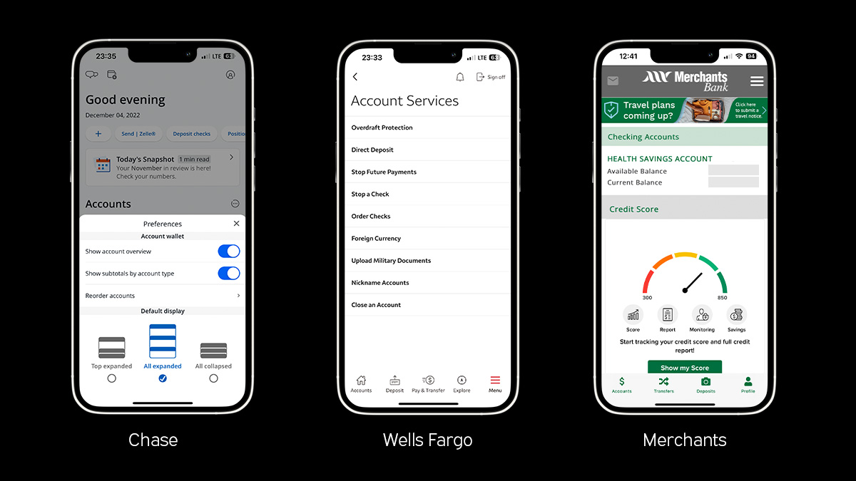
Personalization in the mobile banking apps
Inspecting the banking apps
Good contextually placed personalization – Chase’s dashboard provides personalization and customization that allows experienced users ways to be more efficient. Examples of personalization found in the app:
Quick actions with the ability to add, delete and reorder
Set defaults such as showing or hiding labels, choosing the accordion display and recording accounts
Allow custom labels to adjust the account name for easier scanning
Hidden personalization features – Wells Fargo’s dashboard allows for custom account labels, but the controls are hidden within the settings page and not contextually close. The app does not allow for quick actions or setting defaults, like the Chase app.
No methods to remove irrelevant actions – Merchant’s dashboard does not allow for any customization. For a user without a credit card with Merchant’s, they show a large action to get a credit score and ask to submit a travel notice if they have upcoming travels; two actions that are often relevant for people with credit cards with the bank. There are no methods to remove irrelevant actions on the dashboard.
What’s the harm?
Novice users and expert users have different needs and so adding personalization may help make the app more usable for a larger audience. Shortcuts may also help users find buried tasks more easily by allowing them to be pinned to a more accessible location. When an app does not provide personalization and shortcuts, frequent users may become increasingly frustrated and have a more difficult experience using the app.
Getting help should be easy
It’s best to be clear and not require additional explanation, but often apps need to provide additional support to users who need it.[5] Tesler’s Law states that for any system there is a certain amount of complexity which cannot be reduced.
Mobile banking services a large audience with diverse backgrounds who may need additional support. People using the apps may have language barriers, not understand tax laws, need help understanding fees or legalese and may be seeking support from their bank app.
Considerations when assessing help and documentation within an app, it should:
Be easy to find – help should not be hidden away in a menu
Be contextual relevant – the app should provide the help when the user needs it
Provide concrete next steps – if the action is multi-step, it should guide you through the entire process until you get help
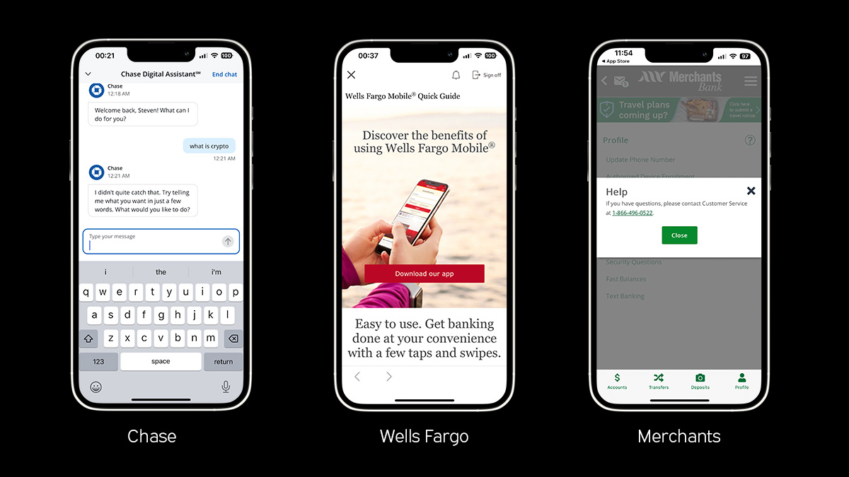
Help and documentation in the mobile banking apps
Inspecting the banking apps
An unhelpful chat bot – Chase has a digital assistant, or a chat bot, available for you to ask it a question and it provides a response. If the chat bot is not given a question it is programmed to receive, it provides you with suggested questions. In practice, this chat bot is less useful and more burdensome than simply having a frequently asked questions (FAQs) section because recall requires more cognitive effort than recognition. The app also has other support features including FAQs, a series of phone numbers and the ability to schedule an in-person meeting.
Somewhat useful frequently asked questions – Wells Fargo has a “Help & Support” section within the menu with documentation and some actions such as making an appointment and finding locations. If you choose to view their FAQs you will see that the primary action on the page is “Download the App”, which is not contextually appropriate because we came from the app. There is some useful documentation including deposit cutoff times and step-by-step instructions for various tasks.
Popup suggesting you call customer support – Merchant Bank has very little support within the app. There were some tooltips explaining sections, but the main “Help” button in the menu leads you to a popup suggesting that you call customer service.
What’s the harm?
Support options for all three apps were inadequate and not especially helpful. Poor assistance for users who are struggling may lead them to not understand features which may prevent them from finishing tasks or cause them to make mistakes. For example, a person may not realize that there’s a limit on the number of transfers allowed for each account until there’s a fee. If they do not realize the rules, and the support does not answer their questions, they might accrue unexpected fees.
Conclusion
After conducting our usability inspection, we have found instances where mobile banking apps followed human factors and even more cases where they didn’t. We don’t know whether the issues found are a result of deliberate choices made by the banks, or if the issues are due to unforeseen constraints.
Overall, all three banking apps performed especially poorly when it came to help and documentation. Chase had the most options, but led us to a chat bot that had limited functionality and unclear inputs. When a bank does not provide a customer with the proper support it may lead to real financial consequences, more than just frustrating the person. This is the most critical area that should be addressed in each of these apps.
The design of the mobile banking experience is much more than what we covered in this inspection. Some other areas that should be explored are:
Account sign up and login process – have you ever been locked out of your account before?
Credit card payments – is it clear how much you owe? Are they pushing you to pay a certain amount each month, such as the minimum monthly payment?
Overdraft fees – banks often allow transactions even if the account balance is too low and charge overdraft fees each time the balance goes below zero.
Each of these bank apps should conduct their own usability inspection or heuristic evaluation and start a plan to make their products more user-centered. If they start focusing more on human factors then perhaps next time you pull out your phone to transfer money to a friend, they’ll have updated the app so it’s so well-designed that you won’t even notice the interface.