Timely
news, current events, politics
In my UX Research and UX Design classes, I interviewed seven people who listen to podcasts on Spotify to learn from their experiences.
I found that most of the users had issues deciding on what to listen to. Over eight weeks I brainstormed, prototyped and tested a potential solution to help with this problem.
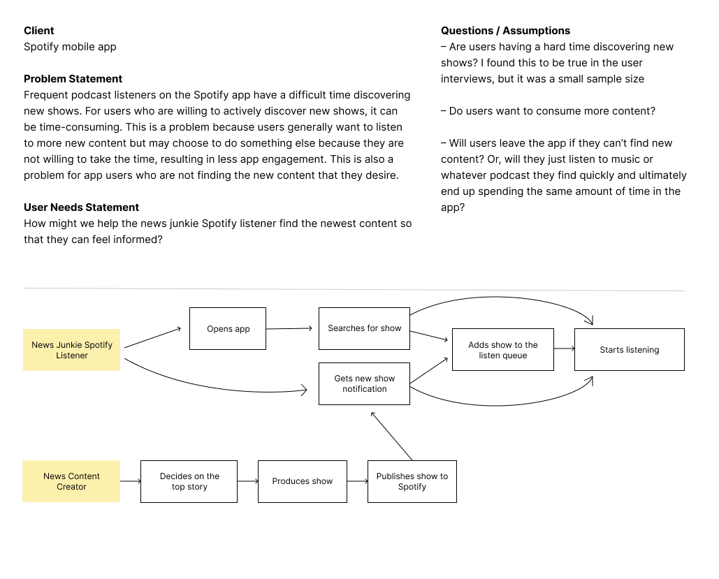
Spotify users have a difficult time deciding what to listen to. Discovering new shows can be time-consuming for the user. This is a problem because users generally want to listen to additional content, but may be indecisive and choose to not listen.
news, current events, politics
released in chapters
comedy, interviews
I focused my attention mostly on timely podcasts.
How might we help the news junkie Spotify listener find the newest content so that they can feel informed?
The primary audience for this project was news junkies who use Spotify.
I planned and executed this project. Throughout the project I received helpful feedback from my UX Design instructor and my peers. I made adjustments based on this feedback.
Time was the biggest constraint. I completed this project during an eight week course where I provided my instructor with deliverables along the way. I am also working full-time, so my time was the biggest constraint.
In addition, I had a tight schedule to recruit and interview four users who fit within the target audience.
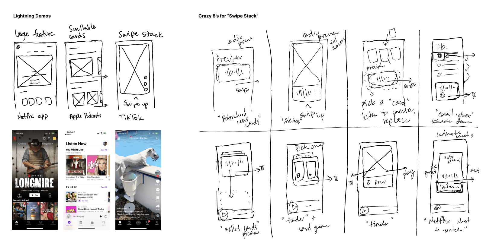
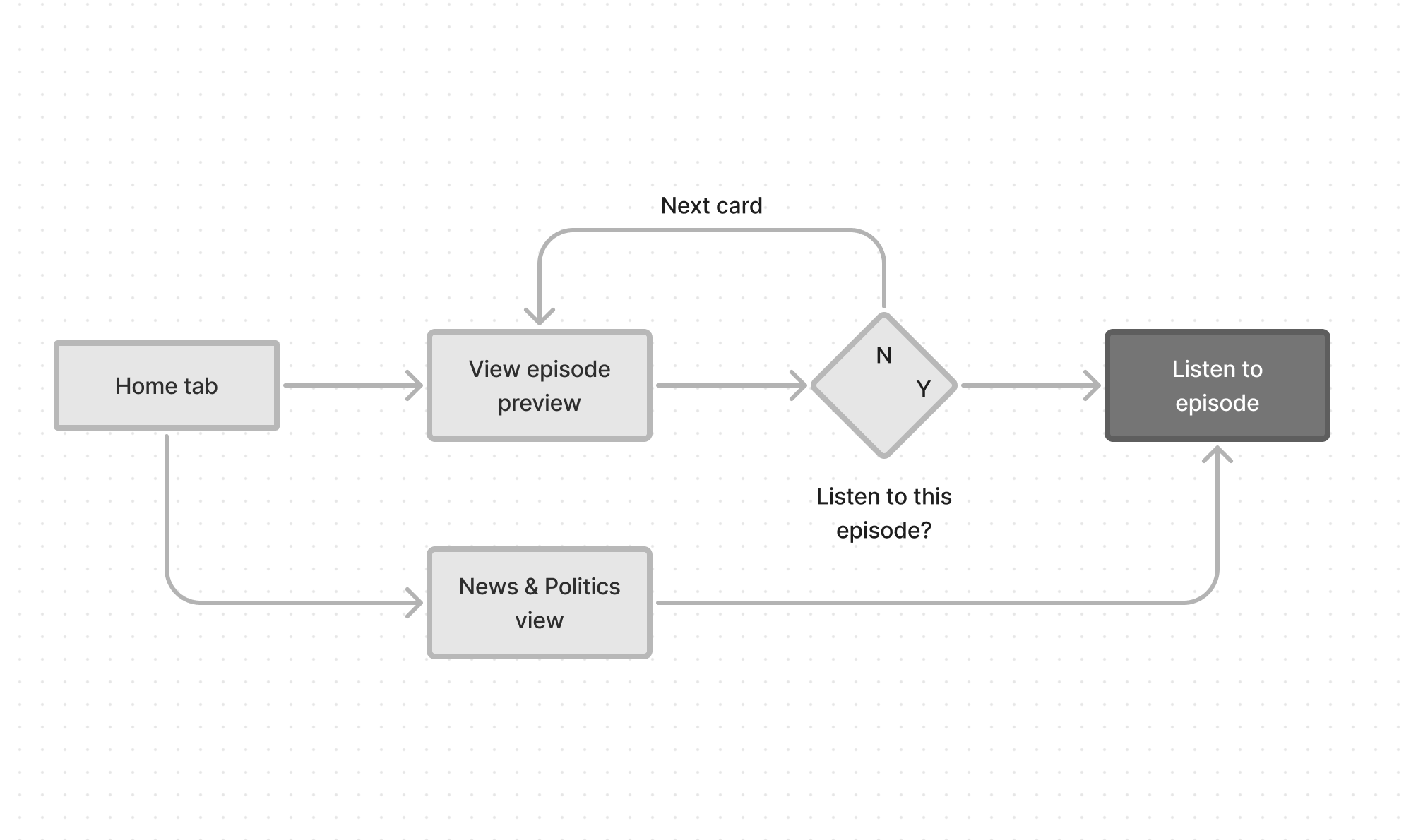
After understanding the steps the user will take and brainstorming potential feature ideas, I created with low-fidelity wireframes to prepare to test this feature with users.
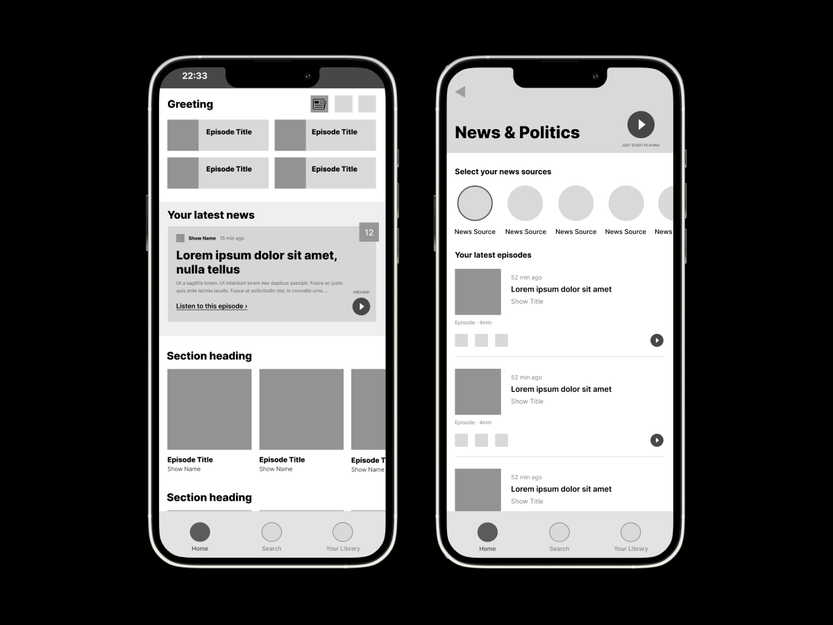
I created a working prototype following Spotify’s brand guide and tested the new feature with four users.
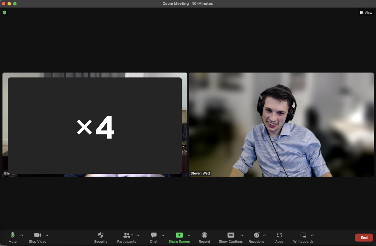
I recruited four Spotify users who identified as news junkies. I recorded their behavior as I guided them through a specific scenario with questions and tasks to perform.
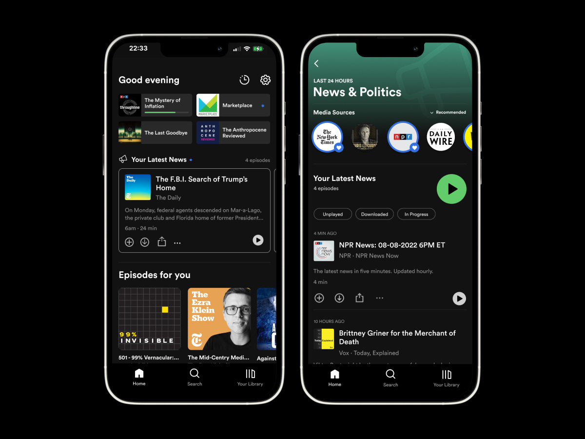
During the user testing sessions there were some noticable usability problems. I iterated the design and resolved the issues.
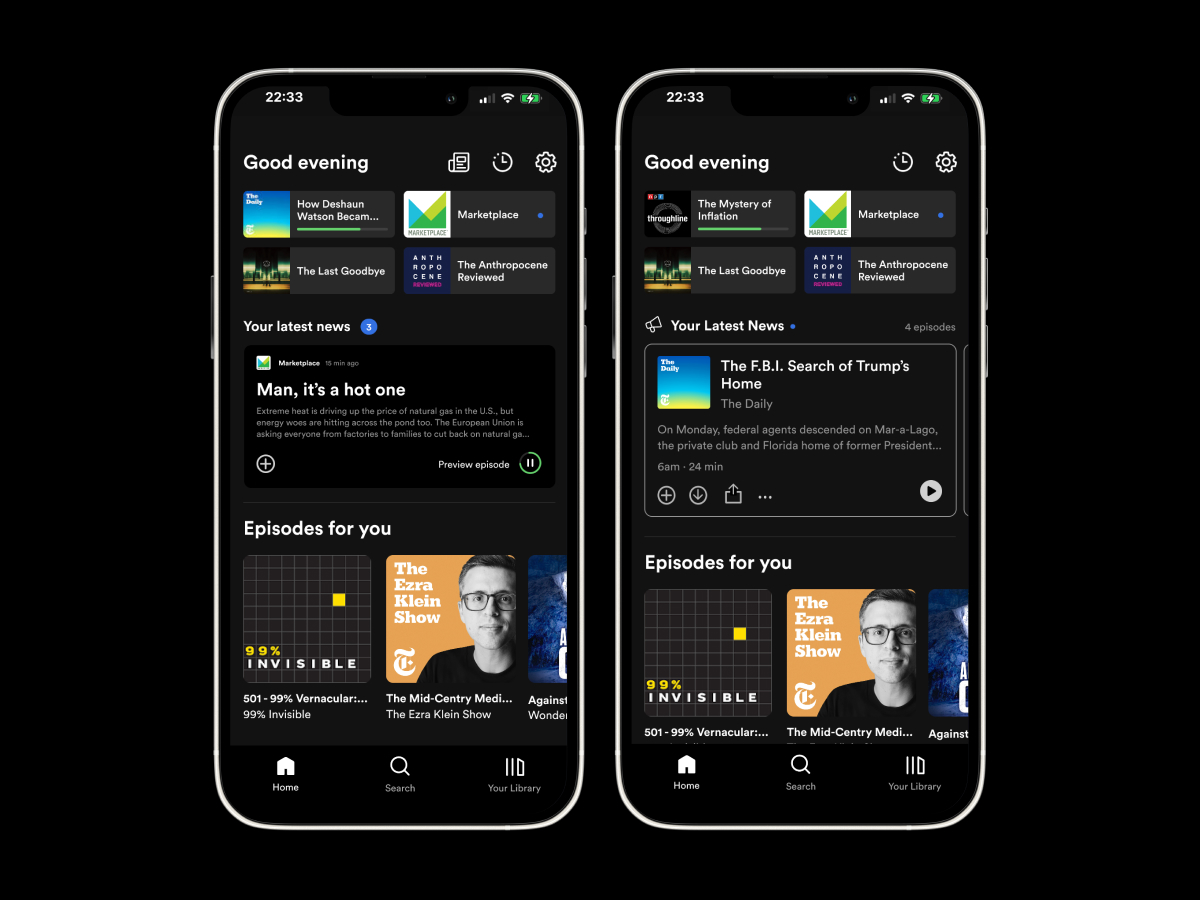
“I think, for me, useful, interesting, easily navigable, makes sense within the existing design paradigm that I know from being a frequent Spotify user. And I think, it's actually a pretty great little widget.”
“But when you put that blue ring, it's like that in my head triggers like, oh, the New York Times has recently uploaded a video that I need to watch.”
“Oh, yeah, this is easier than what I was mentioning before with manually adding them to this list. So you can you know, heart on un-heart, whatever you want to be populated into this list.”
New feature was received favorably by the target audience with some issues:
Continue to iterate and test with larger user testing pool.
Create a working prototype that adjusts the episodes when the sources are changed. Get additional feedback to see if this works as the user intends or if there are further changes to the design. Some updates to test, include: