Competitive Analysis, Interview Guide, User Interviews, Prototypes, Customer Journey Maps, User Testing, Visual Design
Year
2023
Overview
This case study is an overview of my capstone project for the UX Design Master's program that I completed in August, 2023.
Background
I'm a home cook and enjoying cooking meals for me and my partner throughout the week. However, I'm sure my partner would be the first to tell you that I'm terrible at planning meals. When she and I do plan meals we find:
We have an improved mood, relationshop, and healthier eating habits
It is difficult to keep up with a plan
It takes time, mental and physical effort
In order to explore the problem further, I conducted two preliminary discovery interviews with friends who meal prep to help me identify the problem.
Problem statement
Time-constrained home cooks find it difficult to plan meals ahead of time and share responsibilities with others in their household. They want to cook at home, but without a plan they don’t have the ingredients on-hand and don’t want to run to the store at the last minute. Even when they try to plan their meals, they can’t decide what to make and find it difficult to collaborate with their household to execute the plan.
Target audience
Home cooks are my target audience for this investigation. I chose this audience after identifying that I wanted to investigate people who cook at home and plan at least one meal in advance a week.
Strategy
I created a project plan[1] as a strategy for how to investigate the problem further and come up with a solution. In just seven weeks, I interviewed users, analyzed the results and created a workable prototype of a mobile app. To stay on track, I started the project by developing a project plan and oragnized tasks with deadlines in Notion.
I followed the following project strategy:
Competitive analysis – Completed a competitive analysis matrix to understand the competitive landscape
User interviews – Created a screener and interview guide and recruited users. Conducted user interviews
Personas and journey maps – Analyzed user interviews and organized the findings into user personas and journey maps
Prototypes and iterative improvements – This step was iterative. Started with low-fidelity prototypes, conducted usability tests and make adjustments. Upgraded the prototypes to high-fidelity and conducted another round of usability tests and made further adjustments
Competition
When I performed a competitive analysis matrix[2] I found that competitors focused more on the recipes than the plan and didn't have good collaboration features. Below are three major competitors:
Whisk
A popular recipe app where recipes are easy to find and share, however it is riddled with ads and isn’t specifically for meal planning
BigOven
An app that has been around for a while and is known to be good for using leftovers, but the mobile app lacks basic features
Paprika
Popular with meal planners and has many good features, but has separate apps for each platform that require syncing and doesn't have collaboration features
User research
I conducted user inteviews and analyze their responses in order to have a solid foundation of knowledge. I organized the responses in a Notion database and analyzed by affinity mapping using FigJam.
User interviews
Screener criteria
I found participants who fit my target audience, selecting users who:
Cook at home
In-charge of planning meals
Plan out multiple meals at a time
User interviews
I created an interview guide with uniform questions for each participant and conducted twelve, 40-minute moderated user interviews via Zoom. An overview of my participants:
Diverse age range – Spanning from 21 to 71 years
Gender diversity – 5 male and 7 female
Varied household sizes – Smallest household size was 1 and largest was 5
Geographic representation – Located throughout midwest and eastern United States
“I'll look back at what we've eaten the previous week – my husband does not like repeats – and try to keep it as original as possible”
“Trying to make something that fills us up, tastes good, isn’t too expensive, doesn't take too long or make too much of a mess and that’s healthy”
“My partner will text me a list and there're some things that I don't know what they are. I'll have to Google what that item is and see what it looks like”
Interview analysis
I asked each participant the same questions and affinity mapped[3] the responses in order to draw conclusions and identify high-level findings.
High-level findings
I found that most users:
Want a plan, but planning takes mental effort – They want to plan ahead, but find it to be a high-energy task
Are looking for meal inspiration – They’re looking to find new meals so that they’re not eating the same thing every week
Desire to share responsibilities – For households with multiple adults, they want to plan together
Want to avoid food waste – They’re looking to not have food go bad in the fridge and only buy what they need
Usually plan on the weekend – Most people plan on the weekends and plan at least 3-4 meals for the week
Don’t want planning to add extra work – They don’t want the plan to add extra work as they’re not interested in something that adds more work to their lives
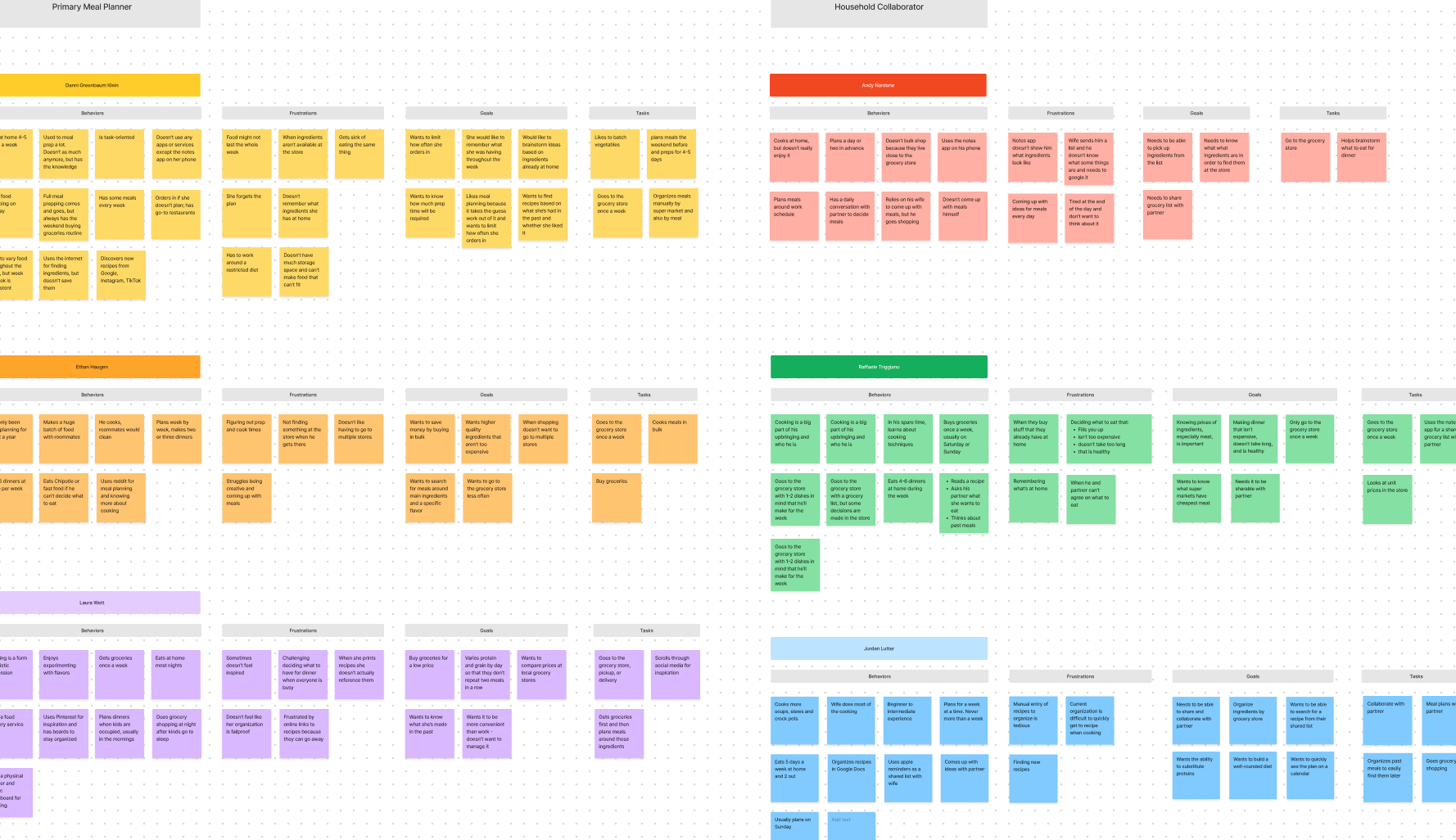
A screenshot of a portion of an affinity map of user interview responses that I created to help me organize personas and draw conclusions for journey maps
Ideation
I sketched on a tablet and used FigJam while ideating for this project. I created sticky notes to conduct my user interview analysis, made rough drafts of user stories and journey maps, and planned my information architecture all using FigJam.
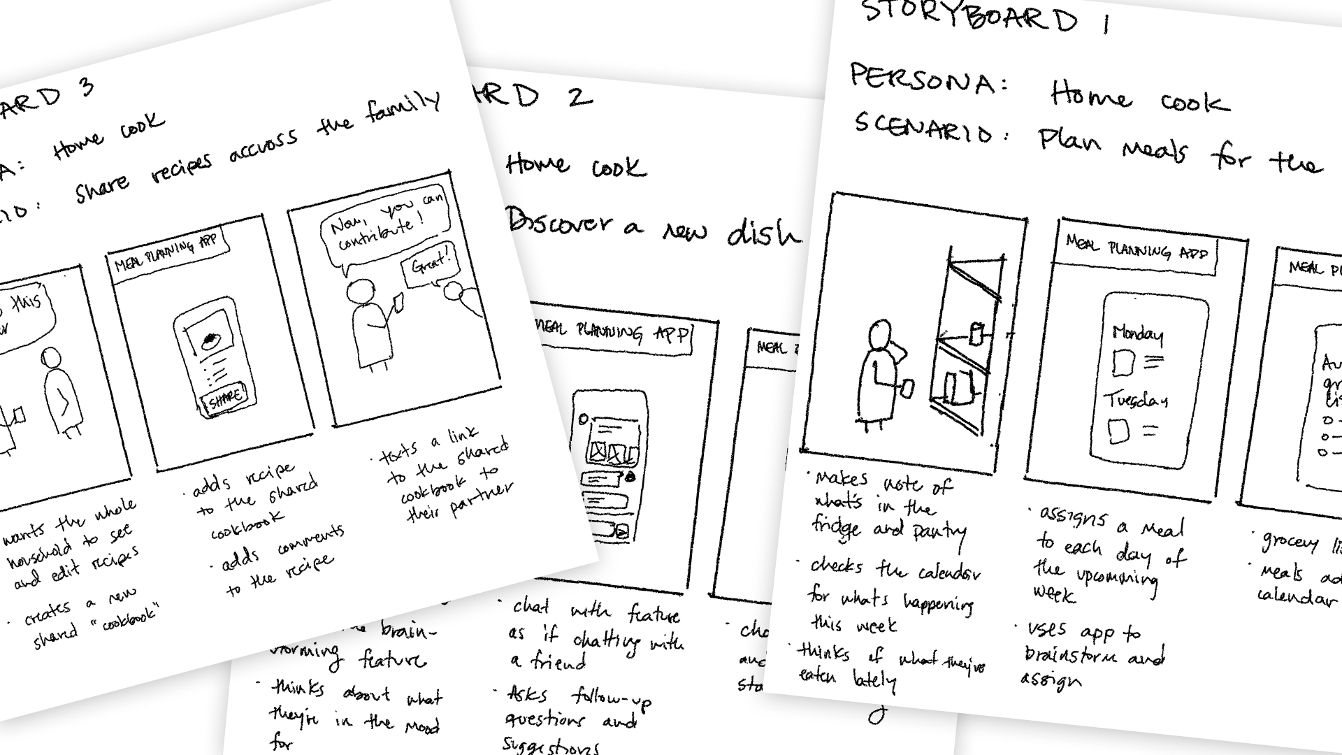
Storyboard sketches that I made when deciding on the user stories
Concept evolution
At the beginning of this project, I had considered making this app focus on fresh produce and connecting local farmers to users. As I started to plan, I realized that I should focus my energy on a single idea and narrowed my scope to only meal planning.
I had also considered making a brainstorming feature using a large language model (LLM) so that users could chat over meal ideas. While I still think this concept could be good for the user, I decided to save this idea for later and focus on other features.
Personas and journeys
From the user interview analysis that I did, I determined two user types: meal planners and planning assistants. I created two personas for the meal planner user type and one assistant and created a customer journey map for each user type.
Meal Planner
The meal planner is the primary planner for the household who plans and cooks at least one meal a week.
Prototypes and testing
An effective way to create user interfaces is to start with broad concepts and test whether users understand what’s going on. Then make changes and test more. For this project, I completed this iterative process twice with low-fidelity prototypes for the first round and high-fidelity prototypes for the second round.
Low-fidelity prototypes
Information architecture
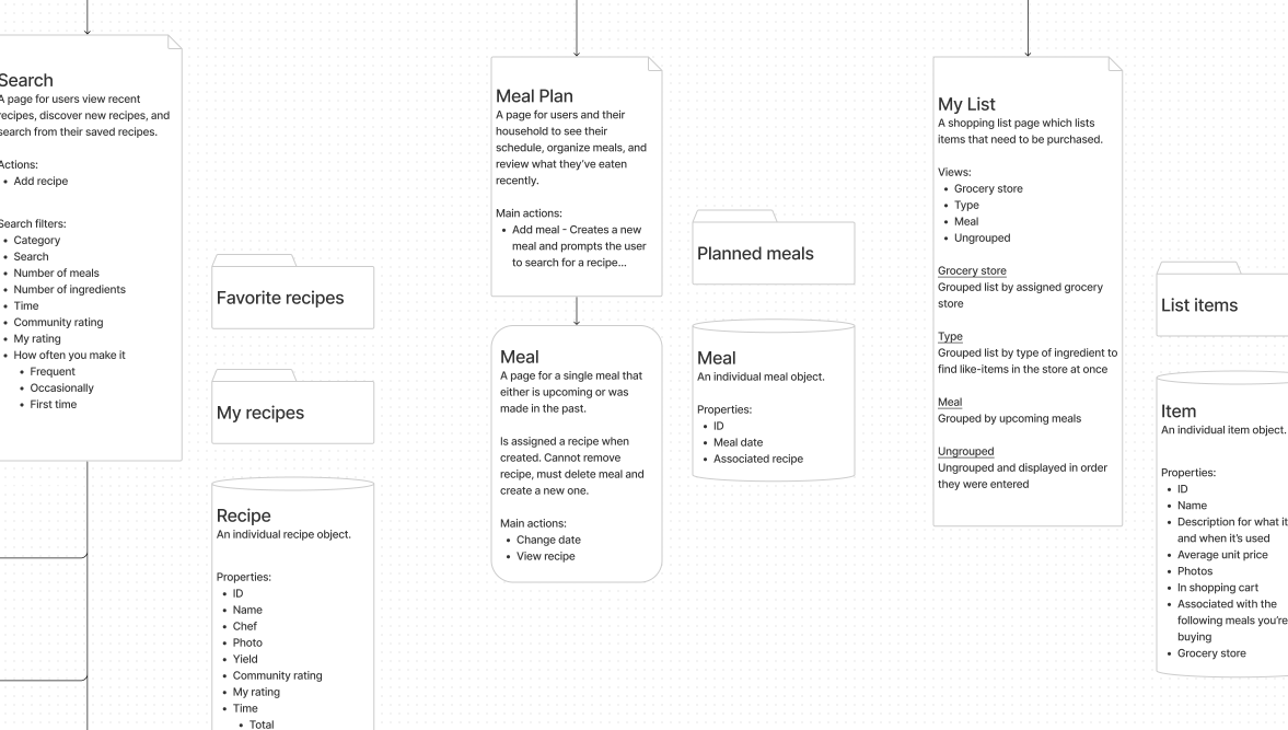
I identified a sitemap of what pages I would need for this app. I then thought about the various components as objects and identified what properties each might have, which is helpful to have internal consistency so that users can understand concepts more easily.
A screenshot of a portion of my information architecture planning board
Usability testing
After creating the prototypes, I pulled from my user testing pool and further screened them to know that they planned at least one meal a week in advance. I conducted:
13 unmoderated user tests
2 moderated user tests
I created a Maze survey[6] that let me conduct unmoderated tests, where users completed tasks independently. I also conducted a couple moderated usability tests via Zoom so that I could ask follow-up questions and dive deeper into their responses.
“I think I was confused on which day was tomorrow based on the app's perspective. Perhaps I was assuming today would be at the top and future dates would be below today.”
“I wasn't sure where to find my boards. I thought it would have been under Lists, but I went through pinning a recipe to view it again.”
User stories
I created four user stories and made a prototype[4] for each. During my usability testing sessions, I had users imagine themselves in a scenario that tested each story.
High-fidelity prototypes
After gathering insights from my low-fidelity prototypes, I made modifications and then upgraded them to high-fidelity. I chose a design system, created new prototypes, and then conducted more usability tests.
Design system
I created a unique color palette and chose to use the iOS 16 design system for my app, which provided me with components and icons. The benefit of using an existing design system is that users are already familiar with components, which can reduce mental load.
The color palette I created for my app, which I used along with the iOS 16 design system defaults
Usability testing
After creating the upgraded prototypes, I recruited from my same user pool and created a new Maze survey[7] to distribute. I conducted:
11 unmoderated user tests
With this round of testing, now that the prototypes feel like a real app, I wanted to make sure that users were still able to complete the tasks and gather feedback.
User stories and demos
The following are the four user stories as well as demos of the prototypes[5] and insights from the user testing.
Reflections
As I reflect on this project, I noticed the following:
Limited timeframe and scope – I only had seven weeks to complete this project so I narrowed the scope to what I could realistically accomplish
Designed a foundation – I designed a foundation, which focused on the core features of planning and collaboration
Recipes aren’t necessarily meals – To keep it simple, currently a meal consists of a single recipe within the app. However, users may make multiple recipes or want to add other items to a meal
Having a shared grocery list is crucial – During my user interviews I learned how important a shared grocery list was for households to collaborate. This led me to focus more on this feature
Next steps
My next steps, if I were to keep working on this project, would be to continue to iterate and test. I would review my journey maps and make sure I was focusing on the primary pain points. Then, the next step would be to create a minimal viable product so that I can start gathering real usage data to inform my decisions.
Some of my ideas for the future:
Explore integrations with stores such as Trader Joes to assign frozen meals to a plan
Expand on collaboration features, such as identifying who added recipes or items to the list
Allow for multiple recipes, or a recipe plus a few ingredients to be added to a meal, rather than just a single recipe
Integrate with meal delivery services or grocery delivery